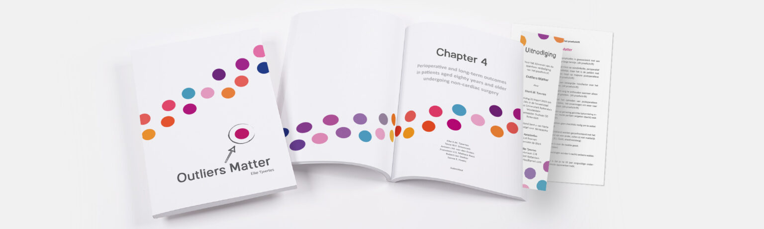
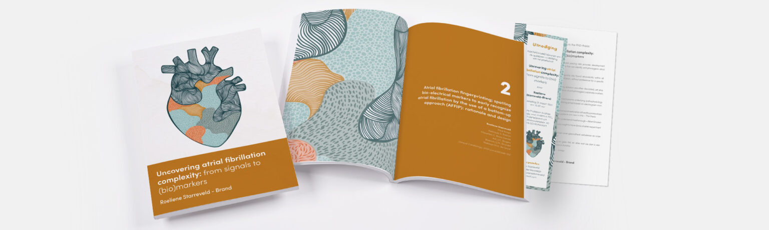
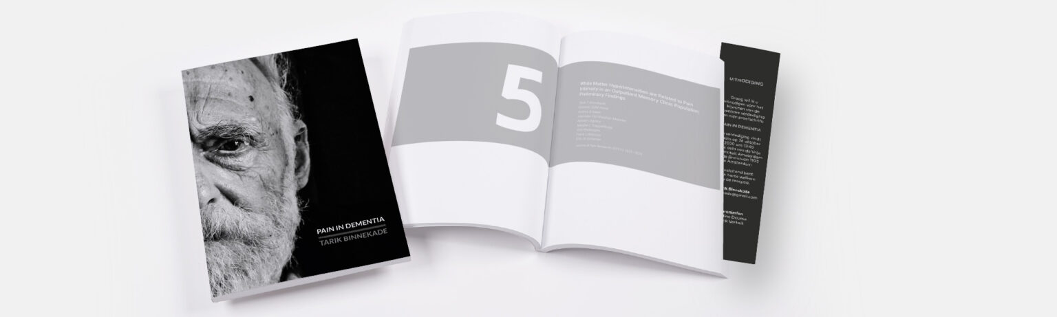
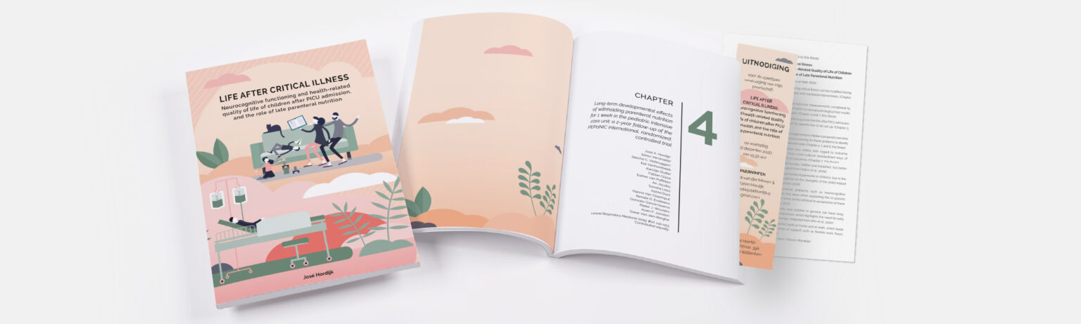
Most used fonts
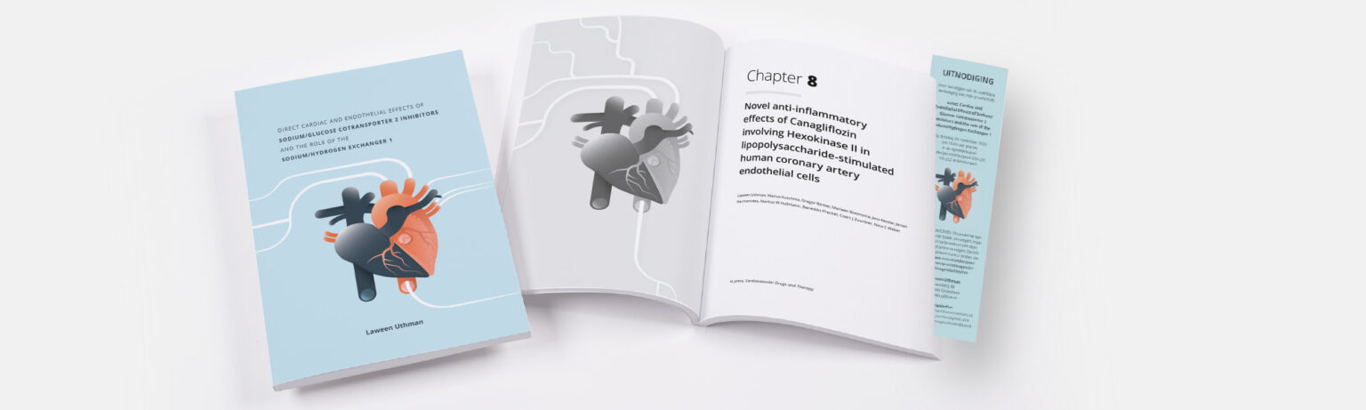
It’s time to start on the layout: your texts are finished and the reading committee has approved everything. You’ve worked hard on your texts, and naturally you want them to be beautifully laid out! One of the most important elements of layout is choosing a typeface. But how do you choose a good typeface for your manuscript? In this article, we’ll set out the The 10 most commonly used fonts Let’s take a look at these, and we’ll finish with a few fonts you’d be better off avoiding.
Sans serif or serif
There are two types of typeface: serif and sans-serif. For a more modern look, you’ll often opt for a sans-serif typeface. This means that the letters have no serifs: there are no thin cross-strokes at the ends of the vertical and horizontal strokes of the letters themselves. Would you prefer a more classic look? Then go for a serif typeface. This tends to look more traditional – it is often used, for example, in old academic publications and textbooks.
Sans Serif
1. Open Sans

2. Source Sans Pro

3. Calibri

4. Poppins

5. Roboto

Serif
6. Garamond

7. Freight Pro

8. Source Serif Pro

9. Merriweather

10. Minion Pro

Fonts you should avoid using
1. Comic Sans

2. Berlin Sans FB

3. Bodoni MT

Are you unsure whether a particular font is suitable for your thesis? You can always check with your designer or ask them to create a sample using some text from your thesis. This will allow you to see clearly whether it is still easy to read and whether the font is suitable. You can also take a look at Google Fonts, there are lots of fonts here that are available for free and which your designer can download.