


How do I choose a font for my thesis?
It’s time for the layout: your texts are finished and the reading committee has approved everything. You’ve worked hard on your texts, and naturally you want them to be beautifully laid out! One of the most important elements of layout is choosing a typeface. But how do you choose a good typeface for your manuscript? In this article, we’ll help you get started.
Font style
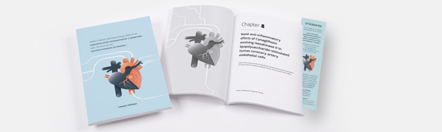
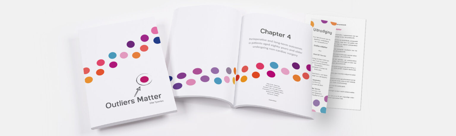
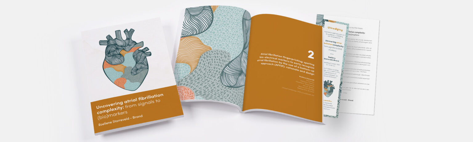
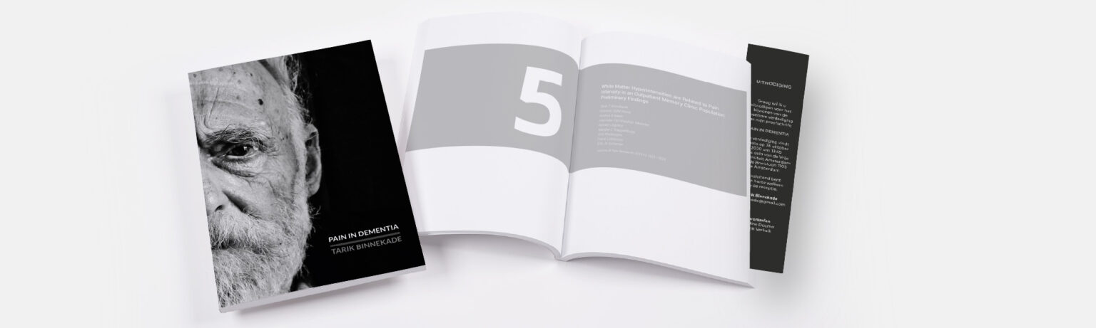
The first thing to consider when choosing a font is the style you want your thesis to convey. Are you going for a more modern or a classic style? For inspiration, have a look at our examples. Once you’ve made your choice, you can start looking for a typeface that suits this style – the exact typeface is often even specified in the example. If you have an external example, your designer can always ask us to take a look and see which typeface it might be.
Modern typeface
For a more modern look, choose a sans-serif typeface. This means that the letters have no serifs: there are no thin cross-strokes at the ends of the vertical and horizontal strokes of the letters themselves.
Some commonly used sans-serif typefaces include:

Classic typeface
Would you prefer a more classic look? Then do go for a serif typeface. This tends to look more classic – it’s often used, for example, in old academic publications and textbooks.
Some commonly used written typefaces are:


Tips
Now that you know whether you want to use a sans-serif or a serif typeface, you can start browsing the vast range of typefaces available. This is largely a matter of personal preference, and there aren’t a great many general tips to offer, but there are certainly a few things you can bear in mind:
-
How many variants does the font have?
A typeface often has many variants, such as italic (in italics), bold (bold), light (thin version) and so on. This is important for a designer, as italics and bold typefaces appear in almost every thesis and are therefore essential for the layout. You should therefore always choose a typeface with a wider range of styles, including at least regular (normal), italic (in italics) and bold (in bold).
-
What are the costs for a specific typeface?
Special fonts can be incredibly expensive. Each variant of a font can cost tens of euros. Have you found a specific font and aren’t sure whether we have it? Please feel free to ask whether we already stock the font you have in mind – that makes a big difference to the cost.
-
Have you already chosen a nice font for your Word document?
When you work in Word for years using one specific font, you get used to how that font looks. This is, for example, why many PhD students opt for Calibri: this font is designed to be clearly visible on screen (in Word, for instance), and wasn’t even created specifically for print. Nevertheless, familiarity with this font (and its good readability) means that many PhD students opt for it.
If you’re unsure which font would suit your thesis best to ensure it’s as easy to read and well-designed as possible, please don’t hesitate to contact us! to include! We’re happy to help you decide. Sometimes the best font depends entirely on the content, tables and data in your thesis, so we’d be happy to advise you.