






Dissertation table formatting examples
Tables appear in almost every dissertation. Sometimes there are hundreds, sometimes just a few, but their design is always important. For many tables, the readability of the data is paramount, but a clear design is also important; naturally, you do not want a chaotically designed table. In this article, we will discuss a number of examples of how tables can be designed. For each example, we will briefly explain the characteristics of that design and its effect on the design of your dissertation.
Below you see four double pages with three tables (the same on every page) – an average table, a smaller table with a different structure of the top rows, and on the right page you see an example of a tilted table.
Dissertation table example 1
In the example below, you actually see the simplest layout for a table. Distinctive lines, with a line thickness of 0.5 points, are only visible at the top and bottom. As you can see, this layout is quite clear for the tables on the left page. On the right page, however, it is slightly less clear – because no horizontal lines are used elsewhere in the table itself, it is somewhat less easy to read. This layout is therefore extremely suitable if you have smaller tables and if you prefer a simple, uncluttered design. If you have many very large tables with a lot of information – which therefore often need to be rotated – it is worth considering placing lines in your table.

Tables example 1
Dissertation table vexample 2
In this second example, an alternating pattern was used. shading of the rows. This means that a grey background color has been used around the row, which provides some visual structure while remaining visually calm. An advantage of this design is that the lines are very clear and the data in the tables of your dissertation are easy to read without looking too busy. You could also apply this shading without applying lines at the top and bottom – then it looks even calmer. In the example below, the lines are as light as possible to match the lightness of the background color. The line thickness here is 0.25 points.

Tables example 2
Dissertation table vexample 3
In this layout, you see a commonly used design for tables: the top and bottom lines of the table are formatted slightly thicker, at 0.5 points. All lines in the middle are slightly thinner, at 0.25 points. In PDF view, the difference in line thicknesses can sometimes be difficult to see, but in the printed booklet, it creates a nice and subtle distinction. This design is simple but is often chosen because it displays the data in the table very clearly.
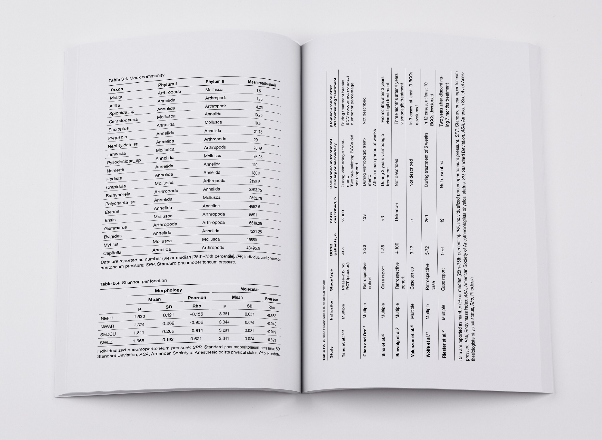
Tables example 3
Dissertation table vexample 4
In this last example, color has been used, as you can see – something that is often only possible if you have your dissertation printed entirely in color. Or if you only have a few tables and are willing to sacrifice the color pages, of course! With a dissertation printed entirely in color, you have much more freedom in your choices regarding color usage in the design. As you can see, fixed elements of the table have been colored: the title, the caption, the top row(s), and the bottom line. The bottom line has been made slightly thicker here (0.75 points) to align nicely with the seemingly wider row at the top.
You could also set the table background to the same color used, but perhaps 10 or 20% of that color. This way, it will stand out nicely against the table background. You could also set the entire table background to the chosen color and make the text white. Whatever you prefer, of course!

Tables example 4