Thesis tables design examples
Tables are found in almost every thesis. Sometimes there’s hundreds of them, sometimes only a few – but the way they’re designed is always important. Usually, the readability of the data in the tables is the most important, but having them designed in an orderly way is also of important. No one wants a messy-looking table! In this article, we’ll discuss a few examples of how tables can be designed. With each example, we’ll explain what the most important aspects of that example are, and what their effect is on the overall design of your thesis.
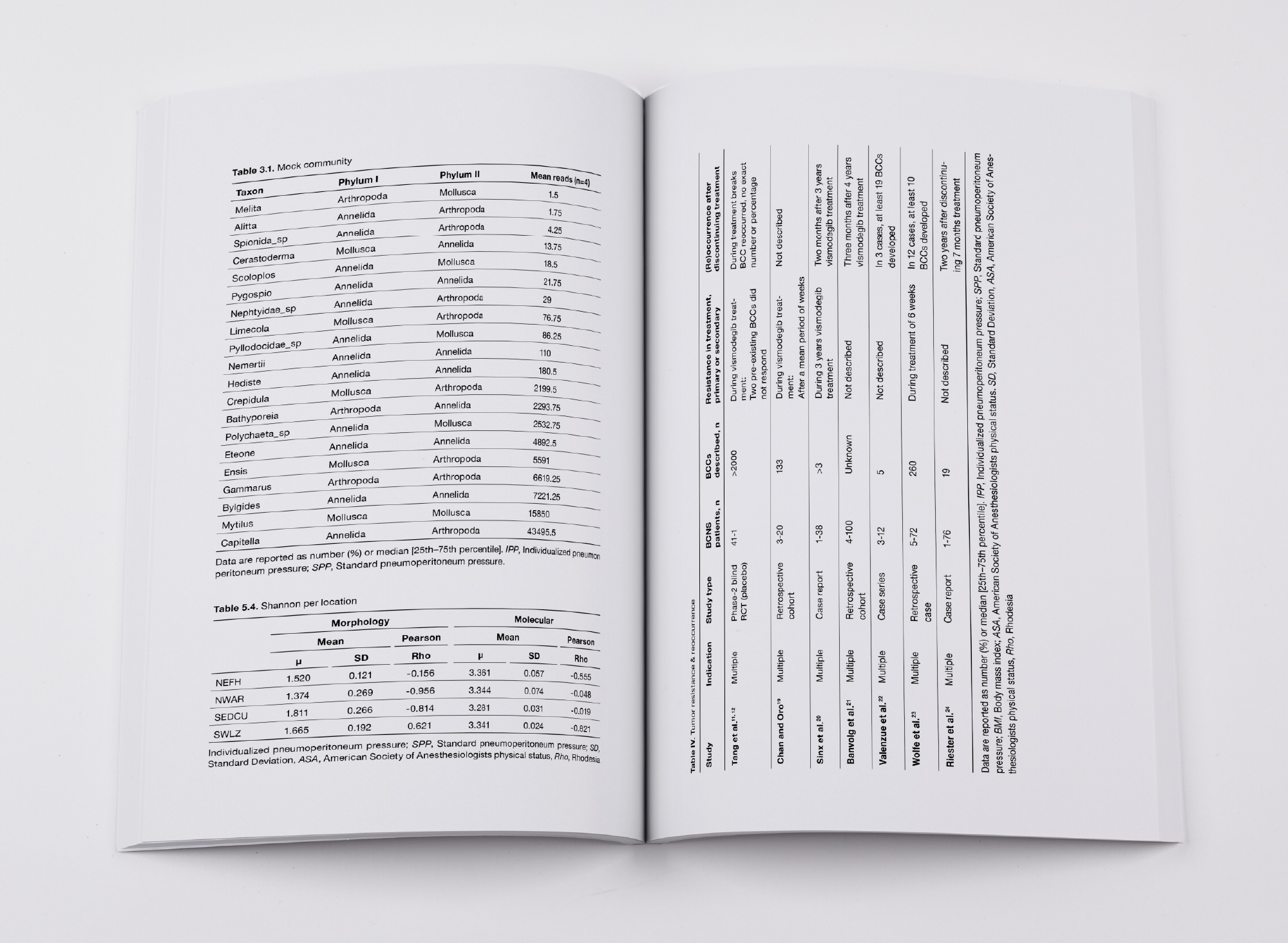
You’ll now see four double pages (spreads) with three tables on them, these are the same in every example. The examples all contain a very ‘normal’ table, a smaller table with a divergent structure and a bigger, tilted table.
Thesis table example 1
Below, you see an example of the most simple design for a table. There’s only horizontal lines at the top row of the table as well as on the bottom. The lines are 0,5 pt in thickness. As you can see, this design is perfectly clear and well-ordered in the tables on the left page. On the right page on the other hand, it’s all a bit less orderly – because there aren’t any horizontal lines in the rest of the table, the data is a bit harder to read. This design, therefore, is very suitable for theses with only smaller tables and if you like simple, clean design. If you have a lot of bigger tables that contain much more information (these tables often need to be tilted), it’s worth considering adding more horizontal lines per row in your table design.
Table design example 1
Thesis table example 2
In this second example, light grey background shading was used every other row. Visually, this gives structure whilst also remaining orderly en calm in design. An advantage to this design is the fact that the lines are very clear, which makes the data in your table very well readable without becoming too ‘busy’. You could also choose to apply this background shading without adding horizontal lines at the top and the bottom – that would make it even calmer. In the example below the lines are as light as possible, to match the light aspects of the background colour. The lines are 0,25 pt here.

Table design example 2
Thesis table example 3
In this example you see a design that’s often used in tables: the top and the bottom lines of the table are a bit thicker, with 0,5 pt. All the lines in the middle are a bit thinner at 0,25 pt. In the PDF-view it can sometimes seem as though all lines are the same thickness, but in the eventual printed book, it gives a nice and subtle difference. This table design is simple but is used very often, because it makes the data very orderly.
Table design example 3
Thesis table example 4
As you can see, colour was used in this last example! This is often only an option if you are having your thesis printed in full colour. Or, if you only have a few tables and it’s worth the extra colour-pages to you. With a full colour thesis you’re a lot more free to choose whatever design options you like. As visible below, certain parts of this table are in colour: the title, the caption, the top and bottom lines. The bottom line is a bit thicker here (0,75 pt), to match the visually broader row at the top.
You could also choose to give the table a colour background, in the same colour that you used for the rest of the table, in perhaps 10% or 20% of that colour (which gives it a nice shade). You could otherwise also choose to make the entire table the colour, and then make the text white. Whatever you prefer, of course!
Table design example 4


